Research Assistant
Skills Used
- Bash
- C++
- Linux
- Machine Learning
- Python
- R
I created an automated pipeline to generate covariance data about protein sequences (CoeViz: a web-based tool for coevolution analysis of protein residues. Frazier Baker and Aleksey Porollo). Covariance data describes the evolutionary profile of a protein, this is useful for determining interaction sites on proteins and relates to protein folding and function. The data processed was open source data: the Baker’s Yeast protein set from National Center for Biotechnology Information (NCBI) database and the BioLiP data is from Jianyi Yang, Ambrish Roy and Yang Zhang at the Department of Computational Medicine and Bioinformatics, University of Michigan. The Baker’s Yeast dataset is simply a collection of protein sequences and the BioLiP dataset is a set of labeled sequences with information about structure and interaction sites.
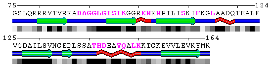
Image of polyview identification of protein protein interaction sites (pink) for test sequence.
This pipeline is composed of bash macros that call python, R, and perl scripts that I adapted or wrote and some more advanced programs that Dr. Porollo has created in his research. This data can potentially be used by machine learning to predict interaction sites on proteins in the future. As part of the pipeline, I first used Basic Local Alignment Search Tool (BLAST) to reduce redundancy in the dataset. These resulting sequences were then run through comparison analysis against a larger database and the results were aligned and interpreted to by other programs. This whole process has taken about two months and may not finish before I leave this summer.
Experimenting With Tensor Flow to Predict BSI Results
In addition to generating covariance metrics, I also worked with using Tensor Flow to predict patient results based on samples. I was given samples about patients over time and labels for which patients became sick over time. There are only about 100 patients in the dataset so that did not leave much room for error or noise (Majority of the normal are designed to work with thousands or millions of data points). To resolve the limited data, I normalized and filtered for redundant data points. I broke the data up by patient and attempted to group the input vectors. The raw data has over 2,000 values per sample. I normalized all the values between 0 and 1 using various methods and grouped the data based on different conditions. I wrote a few python scripts to manage data generation and a few bash scripts to partially automate data generation.
After the data was normalized, I used various methods of machine learning to predict results based on the data. These implementation were developed using Jupyter Notebook in an Anaconda environment with python. Some methods I used consisted of Kernel Ridge, Linear Support Vector Machine, Linear Ridge, and Stochastic Gradient Descent; all methods found in SciKit learn, a python library. Additionally, I used a simple Dense Neural Network (DNN) with Tensor Flow. These methods all took in a patient’s sample and attempted to determine if the patient is sick. The results were about 60 to 70% accuracy with a high false negative rate. This was alright but without more data points, would be difficult to improve.
In order to make use of the redundant data, I decided to use a Recurrent Neural Network (RNN) and used a Long Short Term Memory (LSTM) cell in Tensor Flow’s library to look at a patient’s records over time. This proved to have a much better true positive rate and an accuracy of around 75%. I am spending time tuning the values to improve the accuracy and quality of the neural network. I am using Jupyter notebook because it makes the adapting the network and adding documentation easy. As of now, there is not enough data to conclude that these methods work for classification but the methods do show promise and possible future improvement.
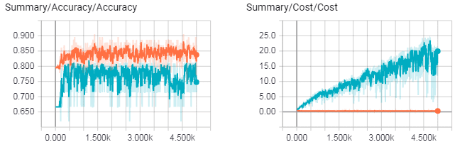
Cost (distance from perfect prediction) of LSTM (left) and cost of DNN (right) as they train. Blue line is validation set, orange line is training set. LSTM avoids overfitting better than the DNN. Images generated using Tensorboard.
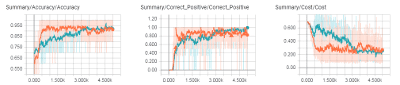
Statistics of finalized RNN Network as it trained. Orange line is training set and Blue line is validation set. Lines are smoothed so dim/background colors represent actual points (smoothing reduces the graph’s variation).
Strucutre of DNN
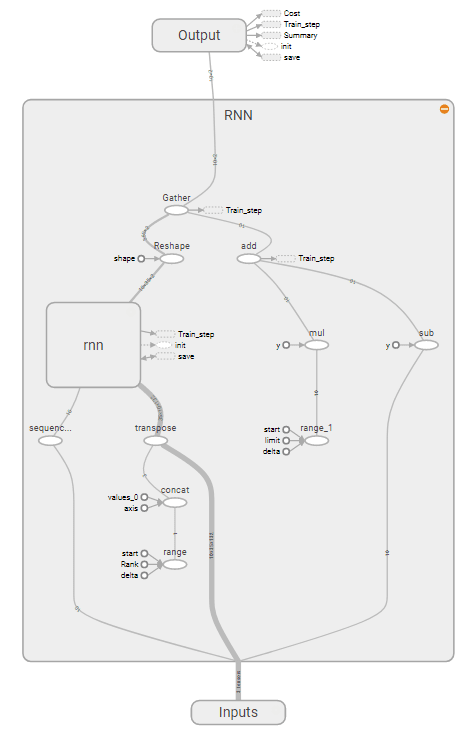
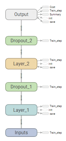
Strucutre of RNN